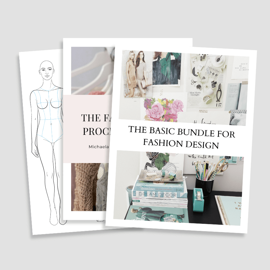
Your Free Gift The Basic Bundle for Fashion Designers
The fantastic genre has never been my thing in the past, so I was astonished about how quick I fell in love with the Game of Thrones show.
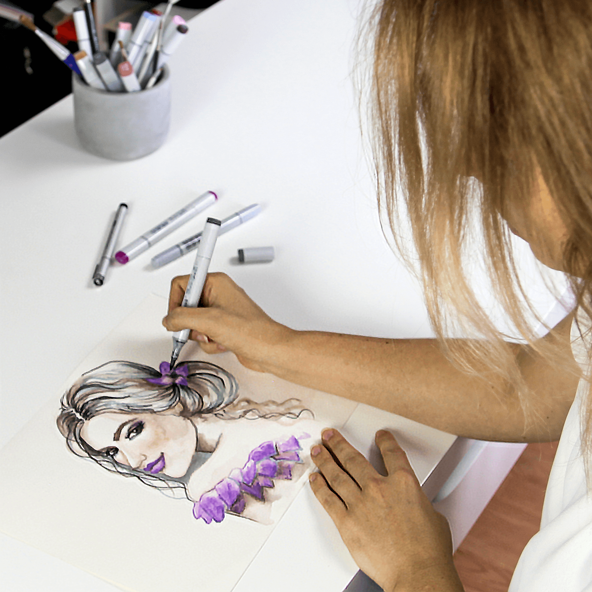
In this Tutorial I’m going to show you how to draw three beautiful Game of Thrones wedding dresses. This is my first time using markers to draw an illustration, so it’s my learning-by-doing day. For me, the tricky part of drawing with markers is the blending of the colors, especially with my collection of colors being relatively limited. I hope you’d understand if I don’t get it right by the first try.
Daenerys Targaryen wears dragon-pins with part of the dress attached to silver arm cuffs. The dress is supposed to look like the color of the Moon, because of how Drogo later calls her the “moon of my life”. It’s a soft colored gown in a Grecian draped style. It’s in a pale silvery grey fabric. The straps are also black and silver. In my illustration they won’t be visible with the hair covering her shoulders.
My first color for the dress is going to be a lavender shade. I want to achieve a rich grayish appearance, yet stay away from a pure grey tone. The second layer is in a light grey, to even out the color.
For the shadows I’m using dark grey and color pencil in walnut brown shade. The fabric is soft so I’m trying to make the drapes flowing by blending the colors gradually. My favorite way of blending markers is layering the colors until I get the desired value. Very much like water colors, apart from the possibility of blending out any harsh lines.
Here an example: for the dark areas of the drapes I’m using a dark grey marker, then I’m deepening the shadow with walnut brown color pencil. Then I’m going with a light grey over all dark areas and blend the colors together. The color pencil will kind of melt into the other colors and create a gradient to the light grey.
If you have made too many folds or drapes, try to fix it by blending them out with the highlights. I’m using an opaque white ink for the highlights, which will help me to cover or at least fade some of the folds out. For highlighting you can use soft white pencils, opaque white inks, white tempera paints, corrector pens, milky gel pens, although the last two are difficult to blend.
For the metallic jewelry it’s best to use high contrasts between different shades of grey and black with white as reflexion. This technique will give the right effect for silver metal pieces. I think this is it, the final dress.
Art supplies used in this video:
HAIR:
Copics: E50, N5, E15
Winsor & Newton: Drawing Ink in white
SKIN:
ProMarker: Blush, Tan, Putty, Sunkissed Pink
Copics: E13, RV 11
DRESS:
Copics: 100, N1, N5
ProMarkers: Lilac
Prismacolor: white, dark umber
Winsor & Newton: Drawing Ink in white
Sansa’s wedding dress when she is forced to marry Tyrion is made of golden brocade. There is a lot of symbolism in Game of Thrones wedding dresses. This one’s golden color, for instance, is like Lannister’s gold is covering her from head to toes instead of her favourite purplish style. The gown is meant to give the appearance that Sansa is trapped in it. The embroidered bands crossing Sansa’s bust-line and collar is heavily embroidered with Lannister lions, bringing down the direwolves of the Starks.
My first color for the dress is going to be a peachy tone. The second layer is Copics E50 egg shell, to even out the color. I want the fabric to look heavy with large and deep folds.
For the shadows, I’m layering several warm brown shades and umber for the darkest areas. I’m first rendering the shadows and then going to use golden ink to add the embroideries. If you want to use a different kind of medium for this part, like pencils or gel pen in gold, I’d recommend rendering the shadows of the fabric after you’ve drawn in the embroidery. In my case, the ink is drying water resistant so I can’t add colors on top of the gold layer.
I’m not trying to be accurate to the details of the embroidery just kind of stylize what I see. This part of the drawing is the most time-consuming. After finishing the embroidery I’m going over a few parts of the gown with a light grey and pale pink to tone down the golden color of the fabric. I don’t want it to be too vibrant or yellowish.
For the bands at the front I applied the same colors I used for the dress, but now for the beads and embellishments, I’m going to use a yellow ocher pencil to set the bands apart from the dress as they are a separate element of it. The highlights and reflections I’m adding in white ink.
The metallic elements of the dress, which look like rustic copper, have high contrasts between different shades of brown and tan with white as reflection. I’d recommend staying away from yellow tones, as they will change the metal’s appearance to gold instead of copper.
Art supplies used in this video:
ProMarkers: Saffron
Faber Castell PITT Big Brush Pen:188
SKIN:
ProMarker: Blush, Tan, Putty
Copics: E13, R02, E15
DRESS:
Copics: N1, RV11, E50, E15, E13
ProMarkers: Blush, Umber
Winsor & Newton: Drawing Ink in white & gold
Faber Castell Polychromos: Burnt Siena, Light Yellow Ochre
Margaery wears very revealing clothing with many cut-outs. Her signature fashion style is sleeve-less, back-less, and with a plunging neckline. Her royal wedding dress is quite a traditional dress with a lot of roses, embroidery, and metal rose vines running along her dress. There are also metal thorns if you look closely. The fabric is a linen silk mix and has leaves woven into it.
I’m starting off with a light cool grey just to define first drapes of the dress, then I’m filling the dress in with a pale beige to give it a warm tint.
For the trail I’m using the same pale cool grey, just to make it stand out a bit against the rest of the dress. I’m applying a darker grey tone to deepen the shadows. If you have a pale blue you can add it as well. It will give a nice touch to the shadows. My blue is too bright for the purpose so I decided to leave it by grey.
I keeping blending the colors by layering them until I get a good value.
For the metal rose vines I’m going to use a grayish green tone with a little deep grey here and there to emphasize the leaves and thorns as a detail. For the rose flowers and the highlights on the metal vines I’m using white opaque ink. This step is optional, but if you wish you can apply some silver to the leaves and some of the thorns. You can use a silver ink like I did in this case or a silver gel pen.
Art supplies used in this video:
HAIR:
Copics: E13, E15, 100, E18
ProMarkers: Saffron
SKIN:
ProMarker: Blush, Tan, Putty, Sunkissed Pink
Copics: E13, R02, E15
DRESS:
Copics: 100, N1, N5, E50, BG01
ProMarkers: Grey Green
Winsor & Newton: Drawing Ink in white & silver
And when you’re super rushed and need a fashion croqui to sketch your ideas to paper without a lot of time or work, you can grab the free Basic Bundle. It features the most essential fashion figure templates for every illustration. It’s a selection of printable front, back as well as side figure templates to help you draw professional fashion design sketches.
You wanna see my secret weapons for running my biz and creating art? Here is a sneak peek at what’s happening behind-the- scenes at Fashion ARTventures.
This is everything I have used and loved, from my art techniques and software, to my filming equipment and platforms that help me run my biz !
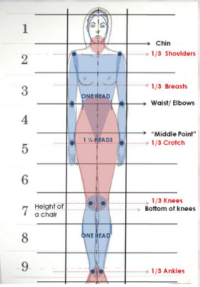
THE BASIC BUNDLE is a collection of female fashion templates in the most essential poses + the fashion design process checklist and the fashion figure proportion scale for sketching the croquis freehand.
Grab your favorite paints or your iPad, put on some chill tunes, find a cozy spot, and let us take you on a journey full of ARTventures! As you color, you’ll be practicing your artistic skills, exploring color combinations, and improving your eye for design.